Plan Pinterest Pins: Connect product images to the right destination
A useful product Pin makes a specific idea visible and leads to a page that delivers on that idea. Plan the image, title and destination together. Your first experiment can start with one original product design, a focused question and a few deliberately different presentations. None of this guarantees reach or sales.
Start with the question behind the product
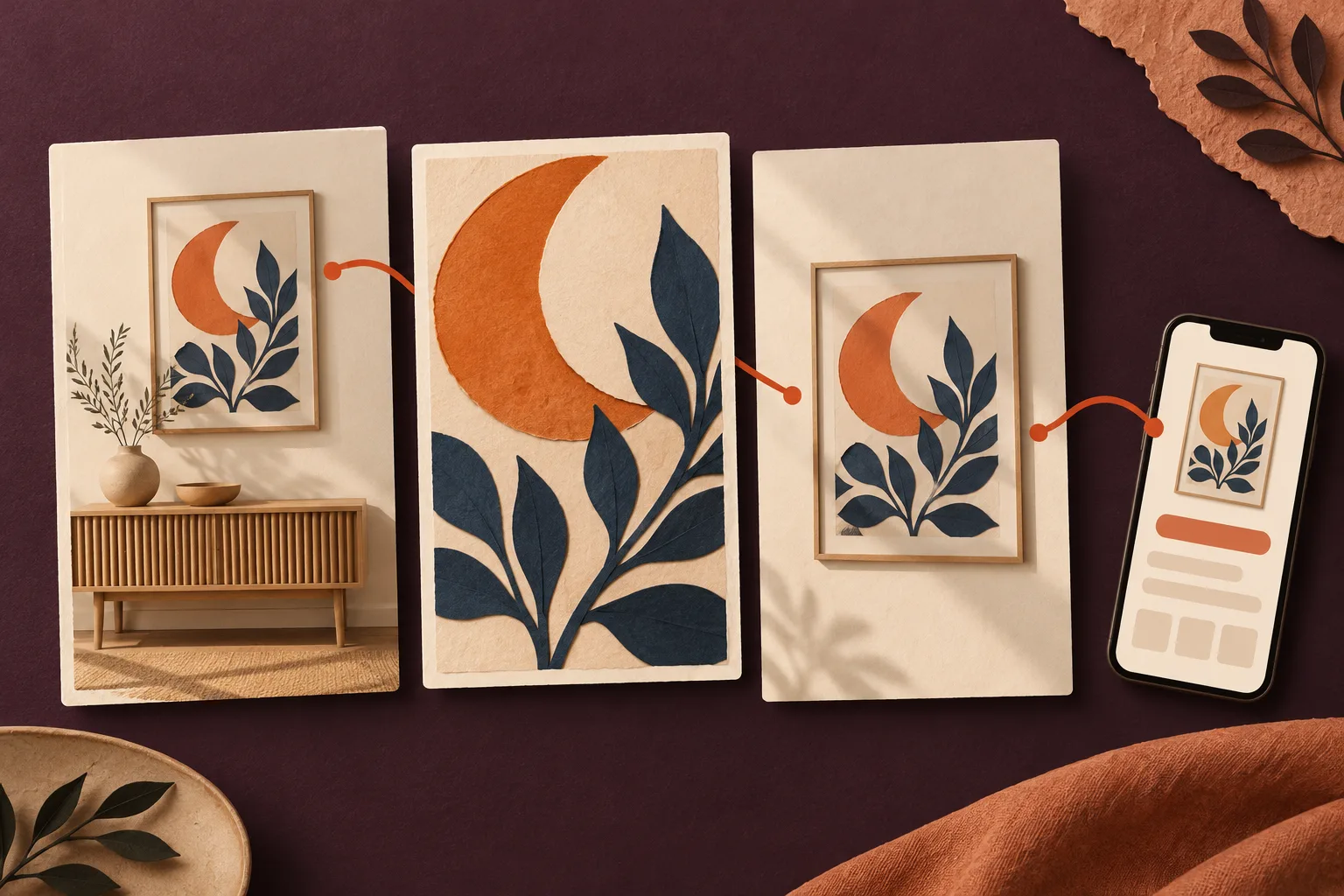
Imagine a small illustration shop. Its fictional poster features an orange crescent moon and dark blue leaves. “How can I create a calm reading corner with warm colours?” suggests a different opening image from “What does this poster look like up close?” Both questions can relate to the same artwork, but they need different answers.
Write one sentence first: “This presentation helps people who …”. If you can only finish it with “want a nice poster”, the situation is still too broad. Choose a small reading corner, a colour combination or a particular wall area. This is your own planning hypothesis, not evidence of search volume.
Three images with different jobs
The example supports three possible designs:
| Design | Image task | Possible title direction | What the destination must answer |
|---|---|---|---|
| Room idea | Show the poster above a narrow piece of furniture | Warm colours for a small reading corner | How does the artwork look in a room, and what size is shown? |
| Artwork detail | Make the crescent and leaves easy to recognise | Crescent moon poster with blue leaves | Which artwork will I actually receive? |
| Product view | Show the complete poster with clear edges | A moon poster for your reading corner | Which sizes and versions are available? |
Use your own images or appropriately licensed assets. A room visualisation needs plausible proportions. A frame shown in the image must not create a misleading expectation about what is included. If it is decoration only, explain that wherever the presentation would otherwise be unclear. The guide to mockups and product photography covers these foundations.
Keep the title, description and link aligned
The official Pinterest guide to creating Pins describes image Pins with a title, description, destination link and board selection. Use those fields to communicate the same idea. A short description for the room example could read: “An orange crescent moon and blue leaves bring colour to a pale wall. Find artwork views and available sizes on the product page.”
Link to the relevant product or topic page. Open it on your phone: can you immediately recognise the artwork from the Pin? Is the advertised version easy to find? Is the package contents description clear? A Pin for a particular poster should not end on a general homepage where visitors have to search for it again.
An organic Pin with a link is an editorial route into your store. It does not establish a catalogue integration, automatic order transfer or a fulfillment function. Those processes need their own setup and testing, independently of the image concept.
Document a small comparison clearly
Begin by comparing two presentations of the same offer. Keep the product, destination and central message consistent, and deliberately change only the visual opening. Record the image version, title, destination URL, publication date and observation period for each design. Differences in distribution can affect the result; a small experiment cannot establish a general cause.
The Pinterest Analytics documentation distinguishes impressions, saves, Pin clicks and outbound clicks, among other measures. A Pin click opens the close-up view; an outbound click leads to a destination outside Pinterest. Pinterest Analytics requires a business account. Choose a measure that matches your question: should people save the idea or visit the destination?
Here is an original example calculation. Design A receives 1,000 impressions and 20 outbound clicks; design B receives 600 impressions and 18 outbound clicks. That works out to 2 and 3 percent respectively. B has the higher proportion, while A has more outbound clicks. Neither figure proves a sale. These are invented numbers, not a performance forecast.
Turn observations into the next change
Many saves alongside few outbound clicks can be a reason to examine the path towards the offer. That does not prove that the title is poor or that people lack purchase intent. Read the image promise, description and destination again as one connected experience.
Keep the next experiment focused on a clear question. Is the product easier to recognise? Is the crop clearer? Does the destination fit better? This creates a traceable sequence of your own decisions. The guide to useful product pages can help you review the final step along that route.
AI-generated editorial collage; fictional poster and conceptual interface, not a real product photograph or platform screenshot.