Small lettering, clear embroidery: Simplify artwork before digitising
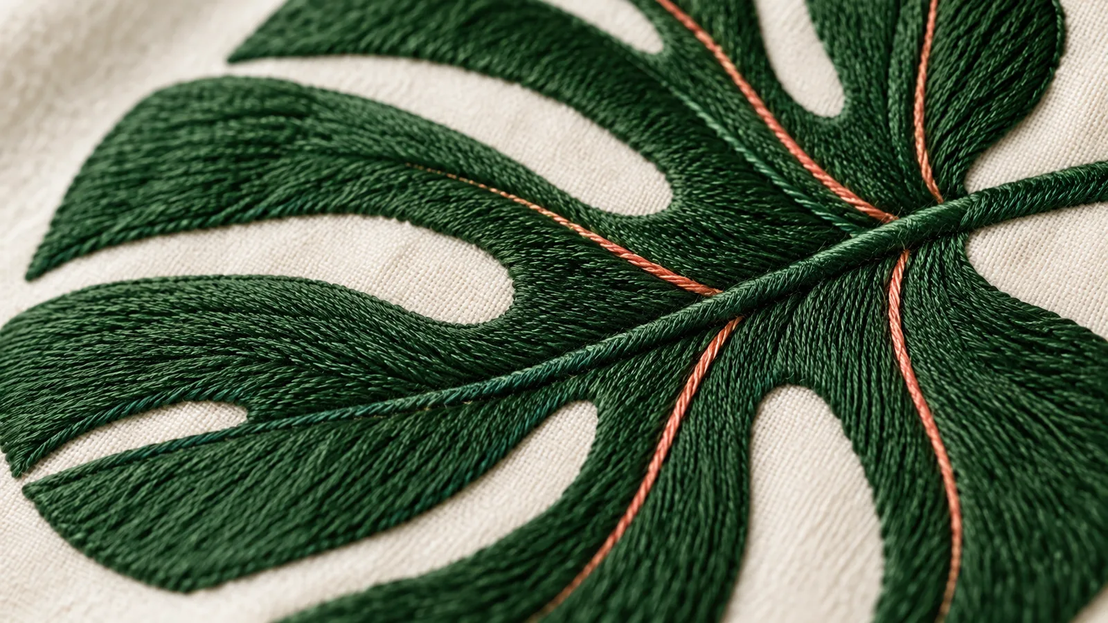
Check small lettering and fine lines at their intended finished size before having an embroidery design digitised. Decide which letters, spaces and outlines need to remain recognisable. A larger image file alone does not solve that design problem. Start with a simplified version, then confirm how it can be produced on the specific textile.
For embroidery, digitising means translating artwork into a sequence and arrangement of stitches that a machine can execute. It involves more than changing a file format. Thread manufacturer Madeira's guide to small lettering explains the relationship between thread, needles and appropriate digitising. Published in 2019, its examples are not a universal minimum-size specification for Shirtee.Cloud.
Which parts of the design need to survive?
First identify the essential element: perhaps a short brand name or the distinctive shape of an illustration. Separate it from decoration. A tiny year, a second outline or a long subtitle may look attractive in a large drawing without being necessary for recognition.
Next, examine the empty spaces. The openings inside letters such as “a”, “e” and “B” are part of the design even though no thread is intended to fill them. The same applies to the gap between two leaves or between a symbol and its lettering. Review the space beside a line as carefully as the line itself.
Use a view at the intended physical size. A paper printout can help you assess proportions, although it cannot simulate embroidery. Check the print scaling and measure the resulting design width. A highly enlarged screen view is useful for editing but a poor sole basis for deciding whether lettering is readable.
An original example: A botanical symbol in three versions
Imagine a fictional botanical mark with the name “Morgenblatt”. Its original artwork includes six leaves, fine veins and a small year underneath. Prepare three versions for comparison:
| Version | Deliberate change | Review question |
|---|---|---|
| A: Original | None | Which details are still visible at the finished size? |
| B: Simpler shape | Remove the veins and year | Does the design retain its character without these details? |
| C: Separate symbol and name | Use the plant alone; retain the name as a separate design option | Can the small application work without lettering? |
These are original design options, not guaranteed production configurations. Compare them at the same overall width first. If you change width, typeface and composition simultaneously, it becomes difficult to tell which adjustment made the difference.
Record what must remain and what may change. “The mark needs to remain recognisable as a plant; the fine veins may be removed” gives the person reviewing it a useful brief. “Please make it exactly like the screen image” leaves the difficult decision unresolved.
What should your digitising brief contain?
Specify the textile, intended position, overall design dimensions and selected file version. Include a preview that makes your intention clear. Ask which source files are actually required and who will create and approve the embroidery file.
In particular, establish whether small lettering or narrow gaps need adjustment. Do not treat a general recommendation found online as a binding minimum letter height: the specific design and material combination needs assessment. A change in finished size is also a reason to review the artwork again, rather than merely rename the same file.
If you have not selected a decoration method yet, start with the overview of DTG, DTF and embroidery. Choosing embroidery does not remove the need to assess this particular design afterwards.
How should you assess a sample?
First inspect a sample on the intended textile from an ordinary viewing distance. Can you read the name without already knowing the artwork? Is the symbol recognisable as a whole? Then examine details: open letter shapes, separated elements, outlines and how the fabric looks around the stitching.
Record observations rather than broad judgements. “The opening in the e is barely visible” suggests a more specific revision than “I do not like the lettering”. Photograph both the whole design and the affected detail under comparable conditions. The general sample-order checklist complements this design assessment.
Finally, keep the artwork version, dimensions, textile and approval together. If a detail changes later, preserve the previous version as a reference and identify the new one clearly. That makes it possible to trace which design was checked and what a subsequent order actually relies on.
AI-generated conceptual embroidery image; not a real product sample or evidence of a particular stitching technique.